More fabric orders go wrong over color than over almost anything else — and most of those disputes trace back to one root cause: buyer and mill were never actually looking at the same reference. “Navy blue” means nothing. Even a Pantone number can mean two different things depending on which edition of which card you’re holding. Here’s how the color-reference world actually works, and how to use it so your bulk shipment matches what you approved.
Pantone: the default language — but know your TCX from TPX
Pantone is the reference most international buyers use, and for textiles the relevant system is the fashion/textile range. The detail that trips people up: TCX codes are dyed on cotton swatches, while TPX/TPG codes are printed on paper. The same color number can read differently between the two, because ink on paper and dye on fiber reflect light differently. When you send a mill a Pantone reference, always state the full code including the suffix — and for woven fabric, TCX (the cotton version) is the more meaningful target.
Other systems you’ll meet
Depending on your market, other references show up: CNCS is China’s national textile color system (a 7-digit code encoding hue, lightness and chroma) — useful to know because Chinese mills work with it domestically. RAL dominates in German/European industrial contexts and often appears in workwear and safety-garment tenders. Munsell and NCS are scientific color-order systems more common in labs and standards work than in day-to-day fabric orders. You don’t need to master these — just recognize that if a tender or tech pack cites RAL or CNCS, the mill needs the exact code, not a “close” Pantone translation.
Why the lab dip still beats every color card
Here’s the uncomfortable truth about all color cards: they tell the mill what to aim at, but they can’t show what your fabric will look like. The same dye recipe reads differently on different fibers, weaves and finishes — and under different light sources. Even the fiber’s luster shifts it: the same shade lands deeper on full-dull versus semi-dull polyester, which is worth checking before you commit lab dips. That’s why professional color approval runs on lab dips: the mill dyes small swatches of your actual base fabric, you approve one physically, and that swatch — not the card — becomes the binding reference for bulk.
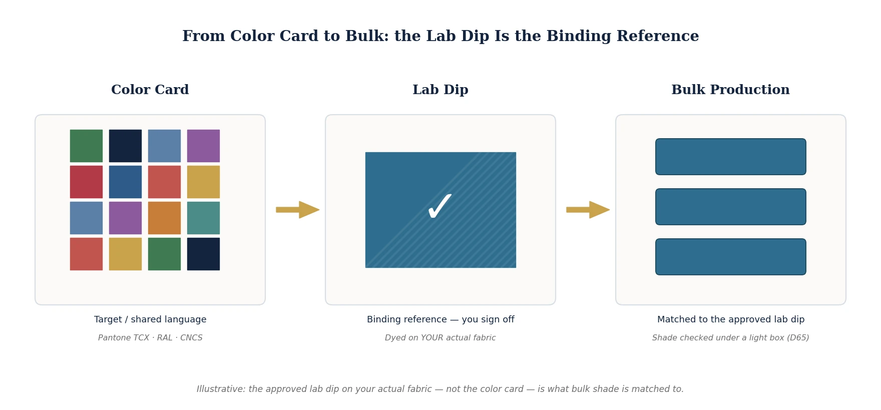
Two practical habits protect you here. First, check lab dips under a standard light box (D65 daylight is the common default) or at least consistent daylight — a shade that matches in office lighting can mismatch badly in a store. Second, state your shade tolerance expectations up front (many programs use instrumental ΔE limits or a grey-scale rating); “must match exactly” is not a specification, it’s a future argument.
What to agree with your supplier before bulk
Keep it to three things and most color disputes never happen: the exact reference (Pantone TCX code, RAL number, or a physical master swatch you supply); a signed-off lab dip on your actual base fabric before bulk dyeing starts; and the light source and tolerance under which shade will be judged. A mill that handles color seriously will raise these points before you do.
At Yongbo Textile, every color order runs through lab dips on your actual base fabric, checked under standard light sources — with dyeing recipes kept on file so your repeat orders match the first. 🌐 yongbotex.com